Design Articles
Tired trend: QR codes
QR codes. We've all seen 'em—they look like graphic design gone wrong, and it seems like they are everywhere lately. It begs the question of whether anyone is really gaining value from them?
QR codes. We've all seen 'em—they look like graphic design gone wrong, and it seems like they are everywhere lately. It begs the question of whether anyone is really gaining value from them?
Although there are some very good uses for QR codes, it seems like companies have started to slap them on everything but the kitchen sink. People have stopped considering whether their user will really find them helpful, which is exactly why we feel they need to go. Here are a few reasons to take caution:
People don't have the technology to make use of them.
You've got to have a smartphone to read a QR code, and at the time of this posting, a quick Google search reveals that only a little over 50% of the US population own smartphones. Thats roughly half the population who won't even be able to use your QR code. But that's not all. Not only does a user have to have a smartphone, they also need to have a QR reader app. I found one source online who proposed that only about 8% of smartphone users have a QR code reader on their devices.
People don't know what to do with them.
Not only does a large portion of the population not have the ability to use a QR code, the fact is that many people just don't know what it is for. I've found this to be true with a lot of the older baby boomers. They aren't all super savvy with technology and many just don't know what to do with that black-and-white checkered box, so they skip right over it. That means, if you've relied on that code as a critical part of your message, this valuable chunk of the population is completely missing it.
Scanning a QR code isn't as easy as you think.
The fact is that scanning a QR code takes several steps. First you've got to have the right equipment (smartphone and QR reading app), if you have that, you need to get our your phone, navigate to the app, launch it and scan the code. That's three steps just to figure out what is hiding behind that ugly black-and-white box. On top of that, you've got to be in a situation where you have a good data connection and can stand still for several seconds in order to scan the code. The chance of someone scanning the code is getting slimmer and slimmer. Consider where you've been seeing QR codes lately—billboards, cars, ads, clothing, and business cards. Of those media, several of them (billboards, cars, clothing) are in motion or at strange angles, meaning they are virtually unscannable by your audience. In the case of the other media (ads, business cards) a QR code is probably more trouble than it is worth. Tell me this, would you rather get out your phone and scan a code to get info off a business card, or would you rather just remember a url?
They're visually distracting.
In addition to all of these functional issues with QR codes, the bold black-and-white checkered box shape is incredibly distracting to any other messaging or branding that surrounds the code. They're really quite ugly and it becomes hard to maintain your brand image when a QR code is in the way. Plus, best practices indicate that a QR code needs to be about one inch square in order to be easily scanned, which makes for a serious design challenge on standard-sized pieces.If all those reasons don't resonate with you, ask yourself this: when is the last time you scanned a QR code? That's what we thought. In fact, while prepping for this post, we discovered that comScore did a study that determined only 5% of the population have ever scanned a QR code. So you're not the only one who has never scanned one.Like we mentioned above, we aren't suggesting QR codes should never be used ever again, they just need to be used at the right time, in the right place.
So when should I use a QR code?
In the few places we've seen QR codes used well, they are implemented as more of an educational tool, rather than a marketing device. They're used to get information about a product that might be out of a customer's physical reach, or as part of a walking tour at an exhibit. They are places where a user has time to digest the concept and gains them additional, extraneous information about something.The fact is that QR codes aren't that useful for users. Plus, you've got to admit they are just plain ugly. Before you slap a QR code on your next ad or marketing piece, think carefully about whether your user will really get value from it, or if you'd be better off using a simple url.
Tired trend: About pages
You're probably thinking I'm crazy. Did I really just assert that About pages are tired? Why yes I did. Don't think I'm crazy. I'm not suggesting that everyone has to ditch their About pages. What I am suggesting is that it is lazy site planning to simply include an About page by default.
You're probably thinking I'm crazy. Did I really just assert that About pages are tired? Why yes I did.
Don't think I'm crazy. I'm not suggesting that everyone has to ditch their About pages. What I am suggesting is that people have gotten to the point where they include an About page by default when they are planning the architecture of a website, and I believe that automatically adding an About page, without considering whether it is truly necessary to your site, is lazy site planning.
In a continued effort to promote simplicity, specifically simpler websites, I would suggest that you seriously consider whether you truly have things to say—that people actually want to hear—on your About page.
So often I see websites that include a summary of the company on the home page, and the exact same content (or nearly the same content) is repeated on a second, separate About page. If you don't have more to say—and remember, the qualifier here is that you need to have more to say that people really want to hear—then you just don't need a separate About page. If you have just a little more to say, there are other ways to solve that problem, such as a modal window or a callout on a complimentary page, that would offer the additional information for your audience to read, in a more appropriate format.
Next time you plan a site, stop and really consider what you need to say about your organization—and what people really want to know about it—before you add an automatic About page.
Trending: Logo systems
Whether you're just starting your business, or you've been in business for years, you understand the importance of your logo. As we'd explained before, a great logo design serves as an identifier for your company—a visual shortcut—and sets the proper tone for what it is like to work with your business. But what if your logo was more of a set of elements, rather than one single item?
Whether you're just starting your business, or you've been in business for years, you understand the importance of your logo. As we'd explained before, a great logo design serves as an identifier for your company—a visual shortcut—and sets the proper tone for what it is like to work with your business.
But what if your logo was more of a set of elements, rather than one single item? That's exactly what a lot of businesses are turning to in place of a single logo.
So what exactly is a logo system?
A logo system is exactly what it sounds like—a system of elements that make up the logo identifier for your company. It typically still includes a base logo form with several variations upon it, so as to create a much more dynamic effect that means the logo has the ability to change as needed across applications. Typically one element of the logo stays the same—usually the shape or the color palette—while another element is specifically designed to change within set parameters. It almost makes the logo system come alive.
When is a logo system a good idea?
A logo system could potentially be used in an logo design, however, if your brand has several arms or related product lines it could be an especially good fit. Before you consider choosing a logo system, it is also a good idea to consider how you intend to execute the brand collateral. If you had intended to do so in-house, it might be tougher to execute the strategy well, than if you intend to maintain a long-term relationship with your designer. Executing a logo system is slightly more complex and usually requires a professionally-trained design eye to make the best use of the system.
Trending: Responsive web design
By now, you've probably heard about how mobile device usage has skyrocketed in the past couple years. With this insane growth, comes a lot more people browsing websites on the web. When most people think of the mobile web experience, they think of people frantically looking up addresses and store hours on their iPhones at stoplights. However, that's not always the case.
By now, you've probably heard about how mobile device usage has skyrocketed in the past couple years. With this insane growth, comes a lot more people browsing websites on the web. When most people think of the mobile web experience, they think of people frantically looking up addresses and store hours on their iPhones at stoplights. However, that's not always the case.
As phones get getting quicker and more convenient, people are actually using them more and more in place of their regular computers. If you think about it, I bet you can remember a time in the not-so-distant past when you grabbed your phone to quickly look something up online, rather than taking the time to walk over to your computer.
The current mobile experience
Up until recently, if you wanted to give your users a mobile experience, you had to build a separate mobile site. Not only can building and maintaining a separate mobile site be expensive and tough to maintain, it can also be an awkward experience, as the site is often structured differently than the "full" desktop version of the site. As mobile usage increases, people are beginning to expect richer website experiences on their mobile phones. Having to pinch and zoom sites just doesn't produce a smooth browsing experience. If we want people to take time interacting with our sites, we've gotta find a way to give them a better mobile experience.So what if you could have one site that serves up both desktop, mobile, and even tablet-optimized experiences?Now you can. Enter responsive web design.
A new and improved mobile experience
Responsive design is a relatively new type of website design that is gaining a lot of steam, and becoming very popular. In a responsive design the site layout (and even content) is designed to change based on the size of the device it is being viewed on. A responsive website uses the same code for both mobile and desktop experiences, but includes additional styling that detects browser window sizes and alters the display accordingly. In fact, you can give it a try right now by resizing our site and checking out how the content layout changes as the browser window gets smaller.Responsive design isn't the answer for every site, but for a basic informational site, it can be a great way to go. It usually costs a little extra, since there is additional design, code, styling and testing to get it right. However, a responsive site is still significantly more cost efficient than creating and maintaining two separate sites.
what does a responsive site look like?
If you want to see a responsive site in action, just resize the browser on our site! If you want to view even more responsive sites, you can check out Mediaqueri.es, a gallery showcasing dozens and dozens of responsive sites.
Trending: Simpler websites
If you haven't yet noticed this trend, keep an eye out—websites are starting to cut the fat and get much simpler. People are becoming more an more harried, and simply don't have time to wade through dozens of menu options, or pages chocked full of lengthy copy.
If you haven't yet noticed this trend, keep an eye out—websites are starting to cut the fat and get much simpler. People are becoming more an more harried, and simply don't have time to wade through dozens of menu options, or pages chocked full of lengthy copy.
Users are in a hurry and don't want excess information imposed on them—they just want to access the info they need, quickly and easily. In addition to users' increasingly busy lives, there are a few other things driving this change.
Social media diffuses dependence on your website
Don't get us wrong, it is still important to have a website in order to provide a consistent, branded experience for your prospects to learn about you. However, with the rise of Facebook, Twitter, Yelp, etc. over the past years, there are a lot more ways for customers and prospects to learn about and interact with your organization. Because social media has made it so easy to get in direct contact with organizations quickly, there is not as much need to provide an over-abundance of information on your website.
Users are in a hurry and don't want excess information imposed on them—they just want to access the info they need, quickly and easily.
Mobile browsing demands refined content
There is a growing movement called "mobile first" that urges web designers and developers to use the brief, often urgent tendencies mobile web users have as a litmus test for site content. Simply put, they focus on refining site content to the most basic items needed by mobile users before choosing to add additional content. With the recent surge in responsive web design, it is now possible to create one website that works perfectly in a desktop browser and also a mobile browser. However, with this comes a need to refine content so that it is brief and to the point. Increased mobile browsing is propelling the trend of simpler websites forward, as there is simply no room for fluff when you consider mobile users' needs.
So how are organizations simplifying their sites?
There are a lot of ways to simplify your site, and different steps are appropriate for different organizations. The best way to simplify your site is to revisit the content it currently holds and really consider if it is all completely necessary, or if it can be cut. This not a time to coddle pet projects, this is a time to be ruthless. Put yourself in your user's shoes—does your user really need to real full-page bios about all of your staff, or would a paragraph do? Is your about page really offering value to your users, or could the most compelling pieces be merged with other content? Sites are also getting simpler in their physical format. People are choosing single-page sites over multi-page sites, drastically reducing menu options, ditching their drop-down navigation, using shorter bits of copy paired with meaningful graphics and many other techniques to help their users get to the point quicker.
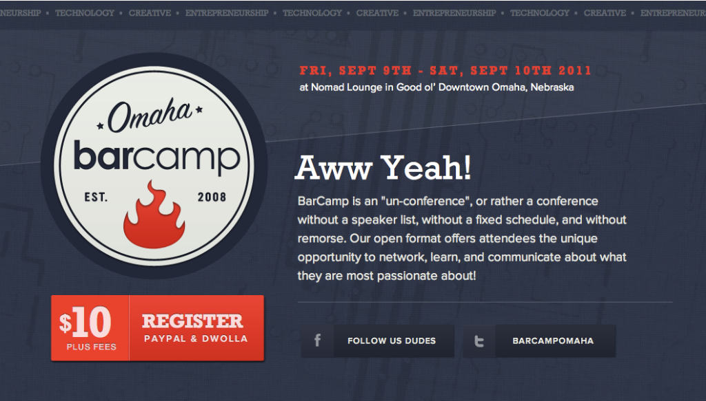
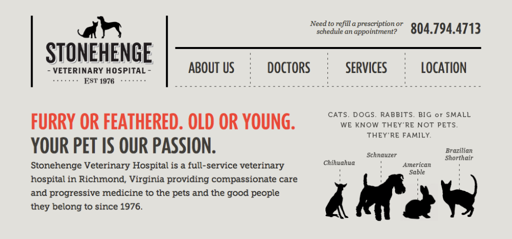
A few examples from around the web


Think we might be a good fit for you?
Let’s talk about how we can design your future.