Trending: Simpler websites
If you haven't yet noticed this trend, keep an eye out—websites are starting to cut the fat and get much simpler. People are becoming more an more harried, and simply don't have time to wade through dozens of menu options, or pages chocked full of lengthy copy.
Users are in a hurry and don't want excess information imposed on them—they just want to access the info they need, quickly and easily. In addition to users' increasingly busy lives, there are a few other things driving this change.
Social media diffuses dependence on your website
Don't get us wrong, it is still important to have a website in order to provide a consistent, branded experience for your prospects to learn about you. However, with the rise of Facebook, Twitter, Yelp, etc. over the past years, there are a lot more ways for customers and prospects to learn about and interact with your organization. Because social media has made it so easy to get in direct contact with organizations quickly, there is not as much need to provide an over-abundance of information on your website.
Users are in a hurry and don't want excess information imposed on them—they just want to access the info they need, quickly and easily.
Mobile browsing demands refined content
There is a growing movement called "mobile first" that urges web designers and developers to use the brief, often urgent tendencies mobile web users have as a litmus test for site content. Simply put, they focus on refining site content to the most basic items needed by mobile users before choosing to add additional content. With the recent surge in responsive web design, it is now possible to create one website that works perfectly in a desktop browser and also a mobile browser. However, with this comes a need to refine content so that it is brief and to the point. Increased mobile browsing is propelling the trend of simpler websites forward, as there is simply no room for fluff when you consider mobile users' needs.
So how are organizations simplifying their sites?
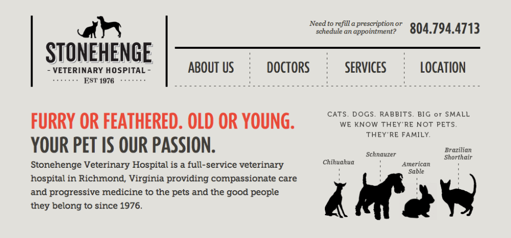
There are a lot of ways to simplify your site, and different steps are appropriate for different organizations. The best way to simplify your site is to revisit the content it currently holds and really consider if it is all completely necessary, or if it can be cut. This not a time to coddle pet projects, this is a time to be ruthless. Put yourself in your user's shoes—does your user really need to real full-page bios about all of your staff, or would a paragraph do? Is your about page really offering value to your users, or could the most compelling pieces be merged with other content? Sites are also getting simpler in their physical format. People are choosing single-page sites over multi-page sites, drastically reducing menu options, ditching their drop-down navigation, using shorter bits of copy paired with meaningful graphics and many other techniques to help their users get to the point quicker.
A few examples from around the web


