Design Articles
Futuralbum submission
A couple of weeks ago, Michigan-based artist and illustrator Troy Deshano reached out to me about participating in his new side project entitled FUTURALBUM. The concept was simple: redesign an album cover of my choosing using an image from the Flickr Book Archive and the typeface Futura for any text. The project sounded like so much fun, I didn't hesitate to accept the offer.
A couple of weeks ago, Michigan-based artist and illustrator Troy Deshano reached out to me about participating in his new side project entitled FUTURALBUM. The concept was simple: redesign an album cover of my choosing using an image from the Flickr Book Archive and the typeface Futura for any text. The project sounded like so much fun, I didn't hesitate to accept the offer.
To choose my album, I hauled out my (very dusty) CD binder and flipped through my collection of discs. Although it seemed important to select an album with an evocative title, I also felt like I needed to redesign an album that I had a personal connection with. I ended up selecting Fort Minor's first—and only—album, The Rising Tied. The album was released in 2005, and was created by Linkin Park's MC, Mike Shinoda, along with two other hip-hop artists. The album was a personal project for Shinoda. Nearly every track features a virtually unknown guest artist, and it seems he used the project as a way to experiment with mixing different hip hop styles.
The research
According to an interview with Fixins Music (courtesy of Wikipedia), Shinoda named the album The Rising Tied as "a play on words." He explained that "this 'tied' group of people are coming up together" as they produced the album. I thought about the concept of collaboration—how on so many of the album's tracks feature a complex web of sounds, and how the album itself features so many artists and their different styles.In addition to Shinoda's idea of the album title, I also thought about what it meant to me personally. When I listen to hip hop music, it makes me feel stronger and as if I can take on just about anything. The feeling of this album title has always produced those emotions in me, as do many of the tracks on the album. And the songs are rich with different textures like waves rolling over one-another.Finally, with the word "tide" is intentionally swapped with the similar "tied," it is easy for your mind's eye to still envision the undulation of a mighty ocean. Although there is no evidence that literal tides were inspiration for the album name, I explored that inspiration point anyway because the mental picture associated so strongly with me. The powerful crashing of waves, and the ebb and flow of the tide just felt like a fit with the music and with the rhythm of collaboration to me. I researched tides and stumbled on an really great video illustrating how tides work, where I learned how the sun, moon and earth interact with one another to effect the tides.
The final concept

In developing this concept, I wanted to create a design that reflected both Shinoda's original ideas of artists coming together and collaborating and my own feelings about the album. I liked the idea of creating some sort of mesh-like element to represent collaboration and realized that I could do that using long oval shapes that also represented the tide patterns shown in the video.
My original intent had been to layer the ovals in different colors so that the areas where they overlapped created additional colors, but this approach proved to be too chaotic and futuristic looking. The music on the album definitely pays homage to the history of hip hop and even some historical events, so the bright colors just didn't fit. I also experimented with a purely black-and-white color scheme but it lacked the passion I felt from the album.
The final artwork features the mesh pattern reversed out of a deep red gradient that creates the feeling of a rally cry. Through these elements I've layered an etching from the Book Archive of a ship at sea, tossed between crashing waves, but still remaining upright. The movement of the waves and the texture created by layering in this image feels like the layers of sound on many of the album's songs. Finally, the type is set (in Futura, of course) on a circular path that represents connection.
The story of Strong Design
Strong Design was conceived in a small bedroom in Grand Rapids, Michigan back in 2001. The original concept behind our studio was to create concept-based design that performs with the strength of a weightlifter. Since that time, we've went through a heck of an evolution. This is our story.
Strong Design was conceived in a small bedroom in Grand Rapids, Michigan back in 2001. The original concept behind our studio was to create concept-based design that performs with the strength of a weightlifter. Since that time, we've went through a heck of an evolution. This is our story.
2002
During my senior semester at Grand Valley State University, we were tasked as part of our Capstone course with developing a personal or studio brand for ourselves or our studio. I was obsessed with weightlifting at the time (an obsession that would stick around for a while) so I thought "Strong Design" sounded like a wonderful name and it stuck. In my defense, there was a concept behind the name at the time—my design reflected the strength of a weightlifter—but as you'll see throughout the rest of this tale I've struggled from time to time with what the name means to me now, over a decade into this Strong Design's existence.
The visuals that I developed to reflect this idea of strength were constructed with a lime green and black color palette—colors I'd thought were bold and strong. The logo was meant to be an abstraction of the end of a barbell or weight plate and featured a bold, black circle with an "SD" reversed out of it. Even then, the Strong Design brand was founded on order and featured a minimal look. In our Capstone class, we also had to develop a website for our theoretical studio. I wish I had a screenshot of the site I created. Even better, I wish I had a screencast of it. It was created in Flash, need I say more? It featured a spinning barbell that kind of zoomed-in—while spinning—towards the viewer. This website was proof that every business will go through phases where they later wonder how they could have gotten something so incredibly wrong.
2003
Apparently, I had the sense to know quite quickly that the Flash-spinning-barbell website was a bad idea. Thank goodness. Unfortunately, I just moved on to Dreamweaver instead—WYSIWYG-style. My gosh, that program wrote some buggy code. Since it was *so* insightful, I stuck with the weightlifting theme and featured weight room images (that I took myself, mind you) on the home page. In light of all the apparent randomness of this site design, the original color palette and minimal aesthetic still ran throughout the site, and honestly, for my second website ever (in a time where there were few websites in general) I don't think this was too bad! Strong Design moved from Michigan to Arizona in the following year, and if you can believe it, this site actually got us work.

2008
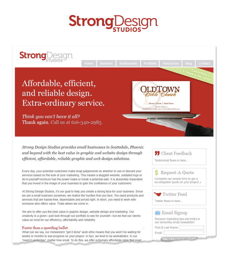
We finally realized that the weightlifting metaphor was a bit tired and did a major overhaul of our brand image and website this year. This was the year of Strong Design red. We'd been using red as an accent for the past several years, and I must have finally realized that light lime green wasn't as bold and strong as I thought it was. We would continue to use some form of red until this very day. It was during this year that we finally began thinking of Strong Design as a business with a message and a story to tell our clients. Not only did we do away with the tired metaphor, but we took the time to write pointed copy that expressed how we believed we were different and what kind of service we aim to deliver to our clients. We even determined a target market. Thus began the era of efficiency and affordability—the pillars of Strong Design in the mid-2000s. Although this is no longer in sync with what Strong Design has become, I'm a little amazed at how refined the brand and the website were at this time.

2009
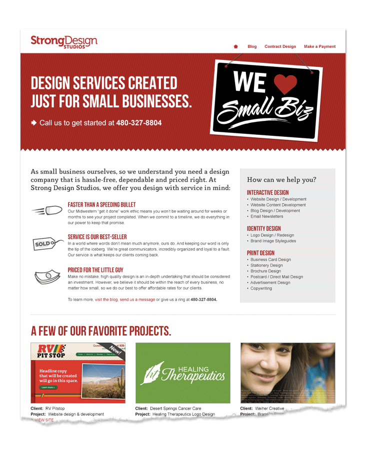
How easy it is to lose that refinement. Apparently, I felt the need for "more" at this time. This site featured more of everything: more copy, more pages, more cliches, more clutter. Plus, bubbly, beveled buttons. The only thing that there was less of was the logo—at this time we boiled the logo down to a purely typographic mark for reasons I really cannot recall (using Museo, of course—it was all the rage). Looking at this site from where I sit now, it seems we were in the midst of an identity crisis (I think the "more-ness" of this era was probably a mask for "We don't know who we are"). Although, we did continue to beat that "efficiency and affordability" drum pretty hard.
2011
The identity crisis continues, along with "efficiency and affordability." The one thing we seem to have figured out by this time was that all the "more" wasn't working, so we boiled the site down to a single-page site (which, again, was a cool new trend). At this point, our brand was so shallow, there isn't really much left to say about it.
2012
By this time, I think we were beginning to understand that there was a depth—a "why"—that was missing from our message. I was working at Forty by day, and Strong Design by night and I was learning from my work at Forty how notable brands are built on the understanding of their cultural values and organizational style and guided by their purpose. A light went off in my mind. I needed to put these ideas to work on the Strong Design brand and uncover what we were really all about.
This year was a huge evolution for Strong Design. I worked one-on-one with my Forty colleague, Kim Higdon, who coached me through my thoughts until I could see clearly what Strong Design stood for. It was at this time where we began to develop what is now known as our brand design process (which was very much rooted in elements of Forty's process at that time). We questioned the name, Strong Design, at many points during the process but in the end, it just felt right to keep it. I developed a metaphor, values, and keywords for the Strong Design brand as a way to create a mental picture of what the experience of interacting with us should feel like.
We determined that the brand should feel simple, accessible, and timeless—much like a craftsman home. In fact, the craftsman home—designed to be both lovely and economical—became the metaphor for Strong Design and we used this idea to inspire the clean, but warm, brand experience. The color palette was selected for its warmth and how it seemed to have one foot stuck in the past, while the other foot was looking forward. The graphic treatments and textures were inspired by typography and signage from the era of craftsman homes. Our brand messaging reflected the ideas of efficiency and affordability (much like a craftsman home, yet also probably too much like our past 10 years of messaging). It was also designed to reflect the ideas of timelessness and simplicity, and we began to winnow our focus into the branding and web design arenas. The ideas of timelessness and simplicity were extremely well-received by our audience who, in the age of the all-marketing-all-the-time nature of the internet, was looking for help boiling their vision down for their brand or website.
As you've seen, we went through quite a few websites and quite a bit of evolution up until this point, so when we set out on this brand refinement, we were working toward the longevity of the website and were early adopters of responsive design. We had a goal for the site to last two years (because honestly, brand evolution or no brand evolution, technology changes so fast that two years seems like an eternity in the world of the web). Well, we made it three years (kicking and dragging throughout that final year). We took Strong Design from part-time to full-time in late 2012 and throughout 2013 it became evident that our brand was still evolving—quite dramatically in fact. By 2014 this image and website felt two sizes too small. It was time to evolve again.
2014
The Strong Design brand needed a realignment and we could feel it. Throughout our first year in business full-time, we evolved our processes to the point that they were no longer as efficient or affordable as they had once been. The "efficient and affordable" mantra had to go. Our focuses were changing. We still wanted to be a partner with smaller organizations, but with the quality of work we were looking to offer our clients, we realized we needed to stop rushing in the name of efficiency and to locate companies who, despite their small size, had the ability to allocate and invest appropriate time and budget into their brands and websites. In short, we wanted to stop flying through piddly projects and instead, focus on becoming a strategic partner with our clients for the long-term in order to help them build meaningful brands and web presences. Nothing about our current messaging supported these ideas.
I'm not quite sure what we were thinking, but we thought a website redesign could solve all of these problems in one fell swoop. We were wrong. What happened was weeks of planning, writing, designing, and even sending the files out for development. Thank goodness for a busy spell that kept our developer from starting on the site. By the time the wave of work smoothed out, we realized the site wasn't an accurate evolution of our studio.

The problem was rooted in the logo. Over the last couple of years, I've been falling out of love with our logo and I felt like it was an impediment to the redesign of our site. We were designing the entire site *around* this meaningless logo. You have no idea what a frustrating conclusion this was for me. Designers may thrive at helping their clients develop their logos, but are notoriously awful at designing their own (look up a few design agencies' logos and you'll see that most of them are barely memorable). I decided I was going to redesign the logo and treat myself like a client this time. The challenge would be to align what we now stood for with that decade-old concept of "strong" design—but how? Believe it or not, it came to me in church one day. The pastor was explaining how the original Olympic champions were awarded a laurel wreath for their victor and everything just clicked for me. I've long understood Strong Design's purpose as a champion for our clients and their businesses—we want to see them win. A laurel wreath is the perfect symbol for that idea, and it fits perfectly with the name we're questioned so many times along the way. We set about ideating this laurel wreath mark which was easier said than done. The traditional laurel wreath icon was overused, the mark couldn't be too literal because that natural look and feel didn't fit with the personality of our studio, and it needed to embody the feeling of victory and the boldness that it takes to get there. After dozens of hours, we finally got there. The mark felt as if it had existed all along.
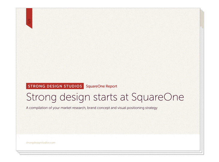
Once we had the logo, I started to redesign the website only to realize that I was trying to design without having taken the time to put together a strategy for the look of the evolved Strong Design brand. Shame on me for not following the tried-and-true process I wouldn't dare stray from with a client. We put ourselves through the full brand design process—taking the time to think through and document our purpose, what we believe, and our organizational style. We even designed the document just like we do for our clients.
Finally, with the strategy in place, it was time to start crafting the website and other collateral using everything we'd learned about ourselves. The messaging we had previously developed was good (we'd put the kind of rigor into the content development that we should have invested into the design from the get-go—a classic case of the shoemaker's kids, right?). The visuals were designed to strike the balance between expressing the distinct Strong Design personality while providing a blank enough canvas to tell our clients' stories in an immersive way.

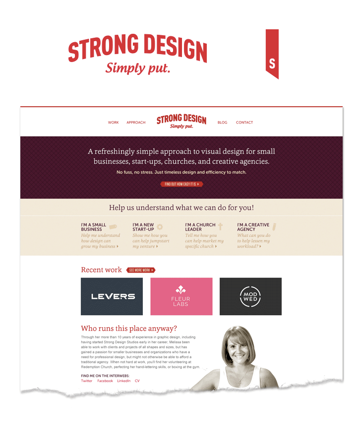
Welcome to the new face of Strong Design. It is a balance of boldness and warmth, of technology and humanity—both distinct in personality and yet style-agnostic. We hope it will last for at least 2 years (where have we heard that before…).
The lesson
If you've gotten to this point in this article, you might be wondering why I've taken the time to compile all this information. There are several reasons:
The first reason is a little selfish: we put a lot of work into this brand refresh and, like a proud parent, we wanted to show it off.
The second reason is hopefully a little more altruistic: We wanted to show that we're just like every other business. If we've worked together before, we've probably talked about how there is no constant for a brand—it is always evolving. The best you can do is capture what you know now to the best of your availability, move forward, then repeat. You can't let perfect paralyze you and become the enemy of something great. We wanted to lift the curtain and show that we have the same struggles. It can be frustrating that there is no "done" when it comes to the development of your business, but the fight is worth it because the fight—and all the "incremental" progress—is what moves us forward.
So tell us, what's next for your brand?
“Leap and the net will appear” desktop wallpaper
Leap into the new year with a wallpaper version of the John Burroughs quote featured on our 2015 New Year notebooks. Available in desktop, iPad, iPhone 6 or iPhone 6+ sizes.

Leap into the new year with a wallpaper version of the John Burroughs quote featured on our 2015 New Year notebooks. Available in desktop, iPad, iPhone 6 or iPhone 6+ sizes. Download the right size using the links below:
Download "Leap" desktop wallpaper
Download "Leap" iPad wallpaper
Design dictionary
Understanding all of the terms that are used throughout a design project isn't always easy, yet it is hard to fully engage in the process if you aren't understanding all of the terms. To help clarify them, we compiled this little design dictionary with some brief descriptions that will help you understand some of the most common terms and concepts we use throughout a project.
Understanding all of the terms that are used throughout a design project isn't always easy, yet it is hard to fully engage in the process if you aren't understanding all of the terms. To help clarify them, we compiled this little design dictionary with some brief descriptions that will help you understand some of the most common terms and concepts we use throughout a project.
Select the term you're interested in learning more about from the list below:
What is white space?
White space refers to the part of a design layout that is devoid of type, graphics, or any other information or ornamentation. White space doesn't have to be white in color, it could be black, subtly textureded, or any other color, the main criteria is that it is simply an area that does not contain information. White space is important because it is used to subconsciously guide a reader's eyes through a design. It gives readers a place to rest and restore their eyes in order to continue absorbing your information with more focus and guides them through your content by accentuating the information that is adjacent to it.
What is CMYK color?
CMYK color is used primarily for the printing process. The acronym CMYK stands for Cyan (bright blue), Magenta (bright pink), Yellow and Black, which are the four colors of ink used in 4-color process printing. During the printing process, these colors are printed over one another at varying opacities in order to produce a broad spectrum of colors. When the inks are printed onto paper, they are absorbed into the paper. Because the color is absorbed, the CMYK color spectrum is not as broad as the RGB color spectrum. It is important to note that the calibration of the press that will be printing your piece can vary, so if you want to try to keep a color consistent across multiple printed pieces you will want to be sure to stick with one print vendor, and if possible, have the pieces printed on the same printing press. If you are especially particular about having a certain color printed consistently, you may wish to look into printing using a spot color.
What is RGB color?
The RGB color space is used primarily on screen, and you probably encounter it the most when viewing websites. The acronym RGB stands for Red, Blue, and Green, which are the colors of light that are combined to render an extremely broad spectrum of colors. The RGB color space can produce a greater quantity of colors because the colors are created from light sources, and no color is absorbed by a substrate such as paper. Because of this, brighter colors can also often be produced using RGB than with CMYK. RGB color can be rendered differently based on the screen that it is displayed on because it is impossible to control the calibration on the many, many screens throughout the world that may be displaying your website. Like all things web-related, we need to simply accept that when working with the web there will be slight differences in color across different screens and browsers.
What is a spot color?
A spot color is a color selected from the Pantone Matching System (abbreviated as a PMS color). Pantone produces a large palette of colors (the Matching System) using very specific pigment recipes, as well as printing inks that match up with each number in the palette, which they sell to printers as pre-mixed inks. Printers use these inks in their presses to consistently print a specific color. These inks are referred to as spot colors, because they are best for printing solid areas of color (a specific spot), and would not be desirable to use when printing an image that involves several ink colors overlaid (such as a photo).
What is a CMS?
The acronym CMS stands for Content Management System, which is a type of software that helps you manage the content that makes up your website. Depending on the needs of your website, your content can be made up of copy, images, videos, audio clips, or PDF downloads. CMS systems have become incredibly popular because they actually enable you to update a lot of your own copy and images on your website in a way that doesn't require you to know much—if anything—about code. That means, when your phone number or address changes, you don't need to bother to call your designer or web developer to fix it for you—you can simply log in to your CMS "backend" system and change it yourself! Although a CMS doesn't enable you to make larger-scale layout changes, the fact that you can make a lot of these smaller changes yourself can translate to a lot less hassle and a lot more cost savings for you!
What is hierarchy?
In terms of design, hierarchy refers to the visual order of importance of a set of elements within a layout. Basically, hierarchy is prioritization. It helps guide readers through information by visually showing them what is the most important. The more information included in a design, the more important hierarchy becomes because users can only process small amounts of information at one time. If you find yourself having trouble "knowing where to look" or processing a layout, there is a good chance it is due to a lack of hierarchy. The first step to achieving hierarchy is defining the main point you hope to convey within a layout. This step is tough because often people try to have multiple "main messages" within a layout. However, it is important to determine the one most important goal. This doesn't mean you can't provide multiple kinds of information, but trying to make many things "the main thing" is completely counterintuitive to achieving hierarchy. Once you know the most important goal, you can consider your additional goals and prioritize them in decreasing order.
What is a minimum viable product?
A minimum viable product is the most basic form of your product or service needed to launch your business. This is an important concept to a startup because, in the course of launching a brand or website, the scope of your product can easily snowball as you dream up more and more features, pushing out your business launch and delaying the ability to start bringing money back into the business. Focusing on the concept of a minimum viable product is important to getting the product up-and-running and moving towards profitability because it requires that "nice to haves" be set aside in favor of focusing on fine-tuning the product's core capability to speed along development and the product launch. A business or product will always be evolving, and a strong business will perfect its core service and functionality first, before carefully implementing additional features and benefits that further strengthen the product.
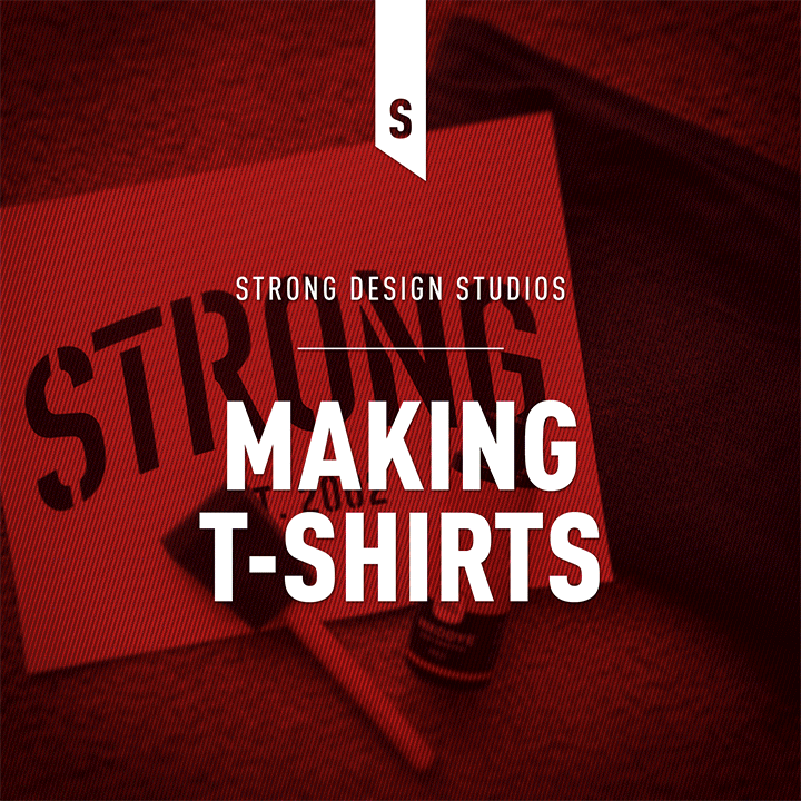
We've been makin' t-shirts!
We recently decided to take a little foray into designing and printing a few t-shirts and wanted to share the process and the results.
We recently decided to take a little foray into designing and printing a few t-shirts and wanted to share the process and the results.
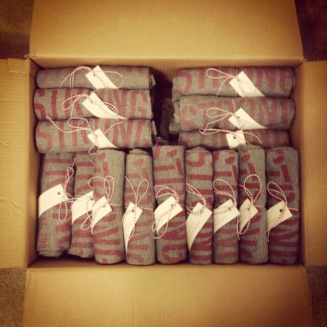
Before going gung-ho with t-shirt printing, we used a stencil and Lumi light-sensitive dye to print a few prototypes (see this handy tutorial for how to create a stencil using freezer paper), and the process really couldn't be easier. Once we knew we liked the results, we ordered negatives from Lumi using their mobile app in order to make printing the shirts a bit easier. We ended up dying close to 50 shirts to send to a few clients and colleagues as a new year's gift, and although creating this many shirts using this process wasn't quick, it sure was fun!
Our t-shirt prototyping process
The final product ready to send out
Think we might be a good fit for you?
Let’s talk about how we can design your future.