2016 ArtPrize design system
This past fall, I had the opportunity to attend ArtPrize in my hometown of Grand Rapids, MI. As defined on their website, ArtPrize® is an open, independently organized international art competition that is hosted by over 200 venues throughout downtown Grand Rapids. It is the world’s largest art competition, and 2016 marked its 8th year in existence.
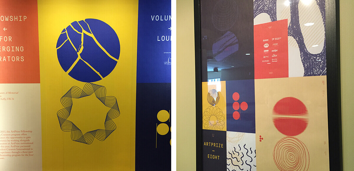
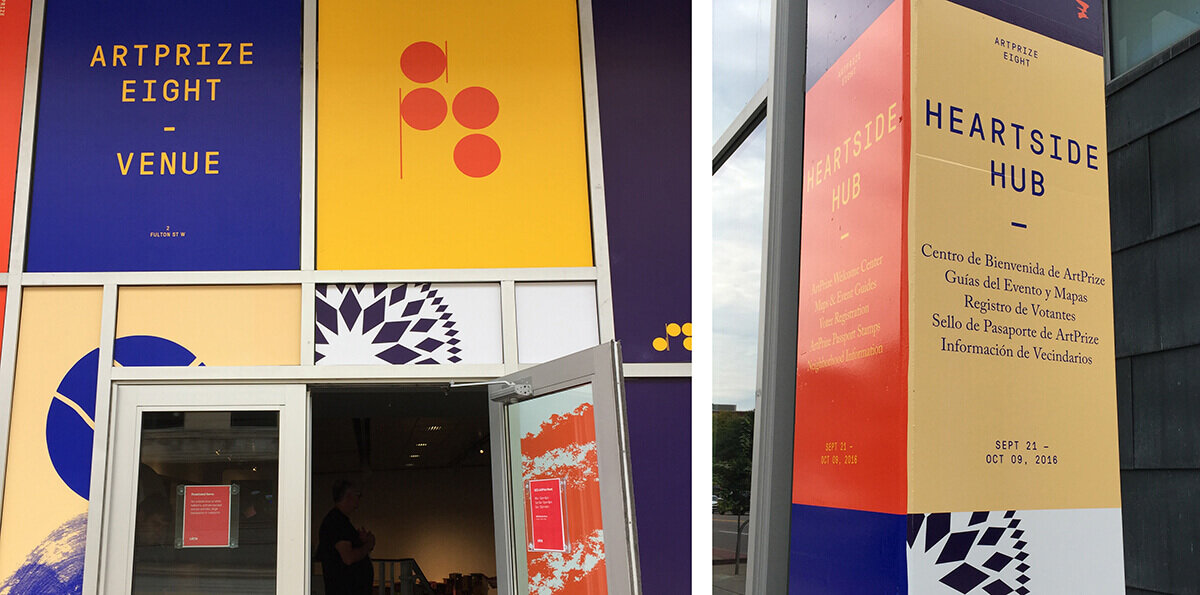
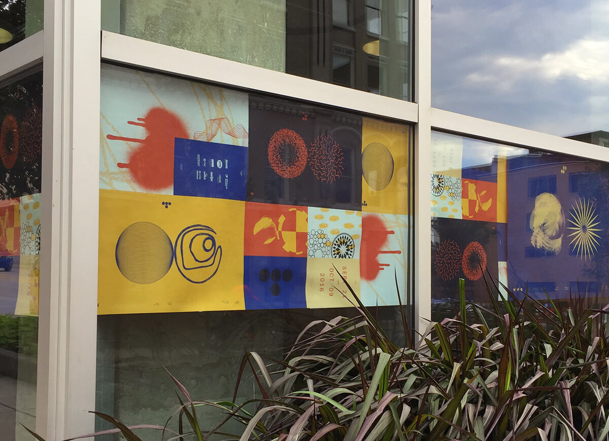
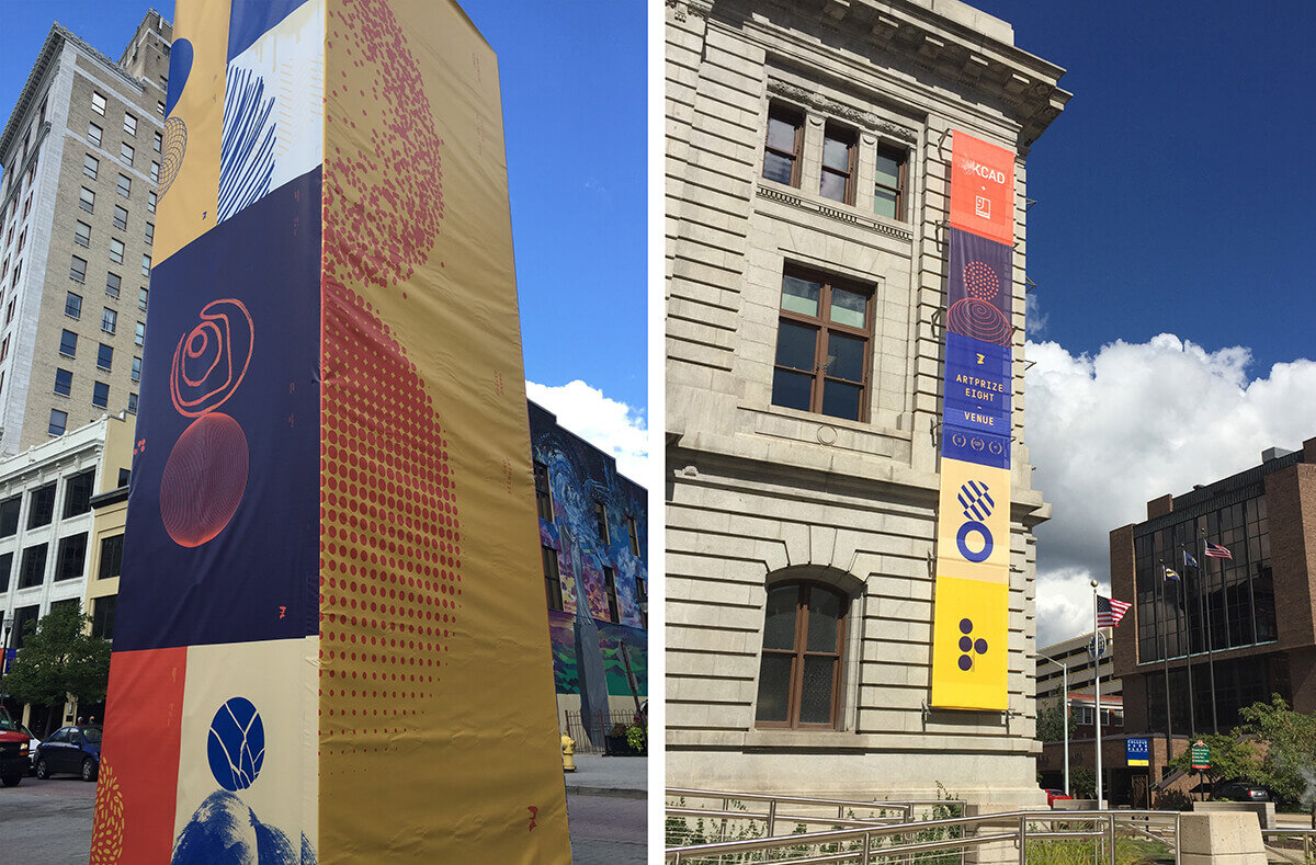
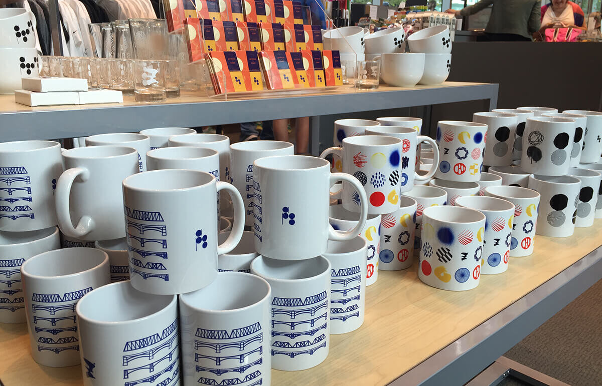
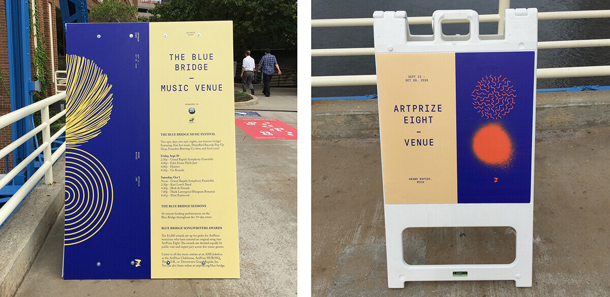
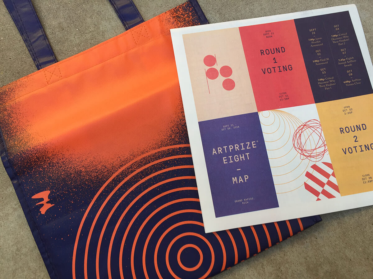
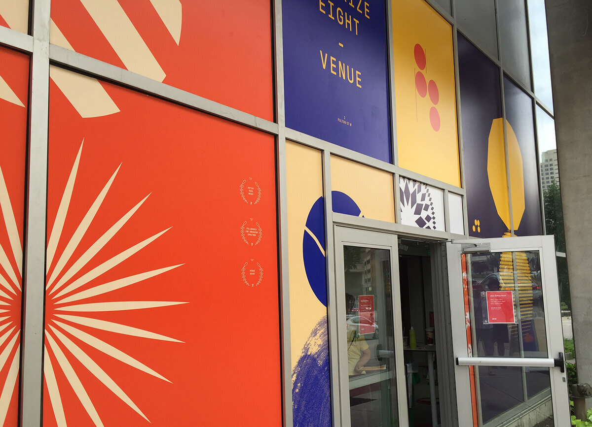
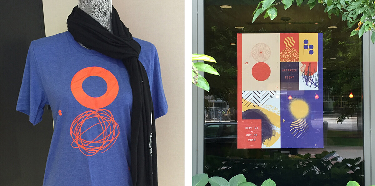
This year, event branding and design was on my mind (because I was on the home stretch of designing the collateral for Phoenix Design Week 2016 collateral), and the ArtPrize 8 event branding was absolutely stunning. It was designed by Conduit, a design studio based in Grand Rapids, and featured a bold color palette paired with a library of art-inspired patterns and textures masked into an abstract 8-shape. Together the elements created a distinctly identifiable design language for the brand. Conduit used the colors, patterns, and 8-shape in a myriad of ways, which created a rich, complex, and exciting image for the event.
Being the design geek that I am, I dare say I paid more attention to the brand system than the artwork at the event. Take a peek at some images of the brand in action below!